


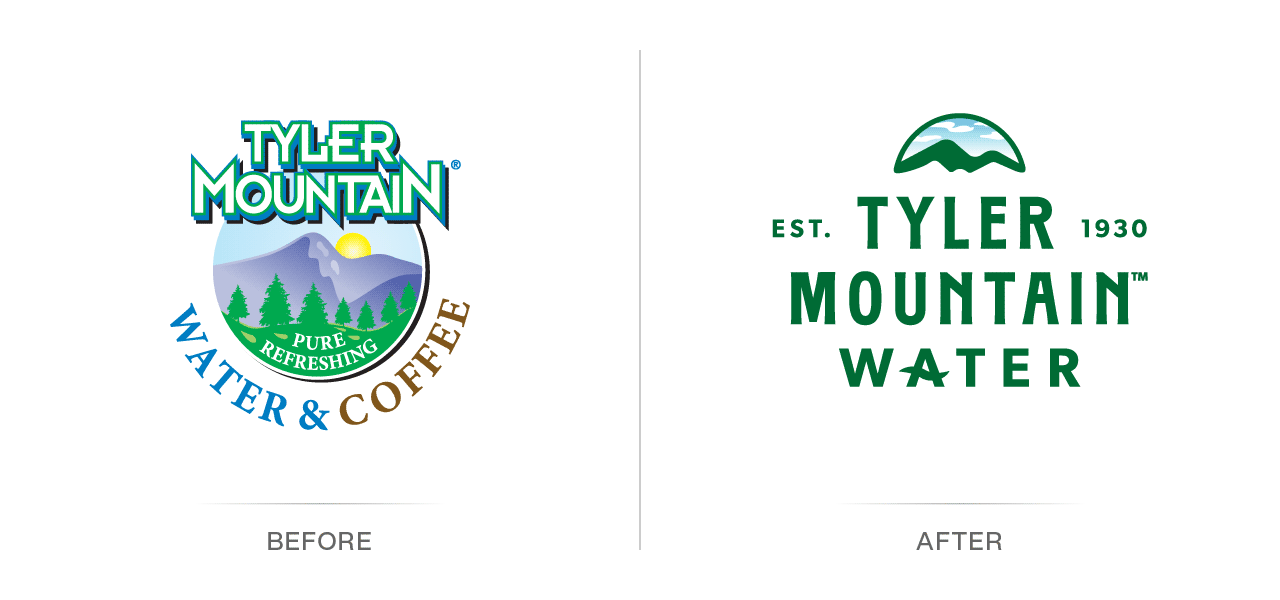
4CDesignWorks has been working with the principals of this popular regional bottled water company since 2009 on various marketing, graphic design, and website initiatives. During a planning meeting in 2025, the existing brand was discussed and the various limitations outlined. While the logo served them well in the past, it had been in use since the early 2000s, and the limitations were becoming more apparent as digital production techniques advanced, especially in social media, truck design and application, and screen printing for bottles. It was clearly time to make a change for future growth.
Existing logo challenges included:
- No established single-color option (which made silk screening artwork on bottles difficult).
- The logo contained multiple colors and gradients (creating difficulties for apparel embroidery).
- There was only one logo lockup option (so it had to be used in square spaces).
- There was no logo text-only or horizontal presentation version (so one-offs had to be created).
- The logo was not very legible at smaller sizes due to several overlapping drop shadow visuals.
Rebranding
The project kicked off with an audit of the existing brand, and the outline of all the concerns and limitations was noted. This new brand had to have a logo suite to provide flexibility, place more emphasis on the name, incorporate a mountain and water, and work better overall at smaller sizes and with limited color.

We have been working on a new website and overall corporate branding with 4CDesignworks, and we are pleased with their ability to go out of their way to understand our business. Their experience in branding, ecommerce, SEO, social networking, and content management is exemplary.
– Joseph Bell, Vice President, Sales & Marketing, Aqua Filter Fresh, Inc.
4CDesignWorks Branding Process: Education and Evaluation
A competitive analysis was run on several national bottled water brands to gauge how many have changed over the years and how often. Most of this is product-driven by labels. At the regional level, this is also true for the number of single-serve bottles; however, the vehicle wraps on many delivery trucks and the truck fleet are significant investments that must last and not be completely redone every year!
After the education and evaluation parts of the 4CDesignWorks branding process, it was time to move into the execution and building the brand.
Starting with the logo, several concept sketches were created as starting points for further refinement and digital rendering.
Initial New Logo Options
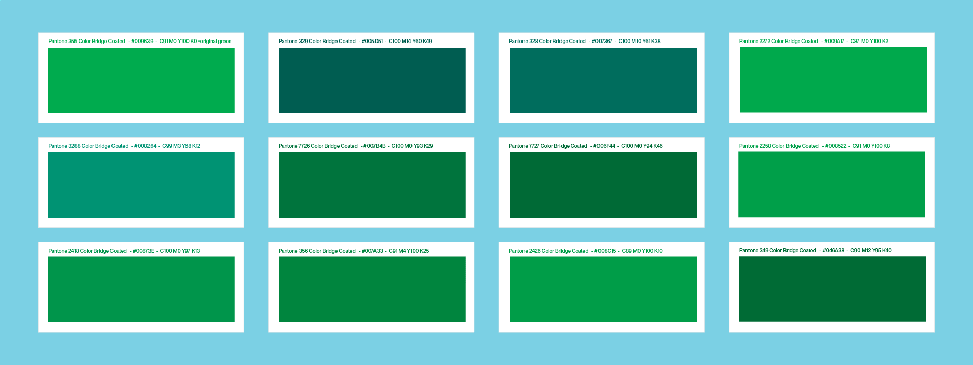
The phases of execution were broken into initial options, in which a suite of logo lockups, colors, and fonts were presented and discussed. The focus of this phase was to zero in on preferences and variety before further refinement. Based on the widespread uses the logo lockups all had, a square lockup option, a horizontal lockup option, a stacked/centered lockup option, a badge presentation (with additional information), a glyph option (for shorthand and small areas), and an icon.
Refined New Logo Options
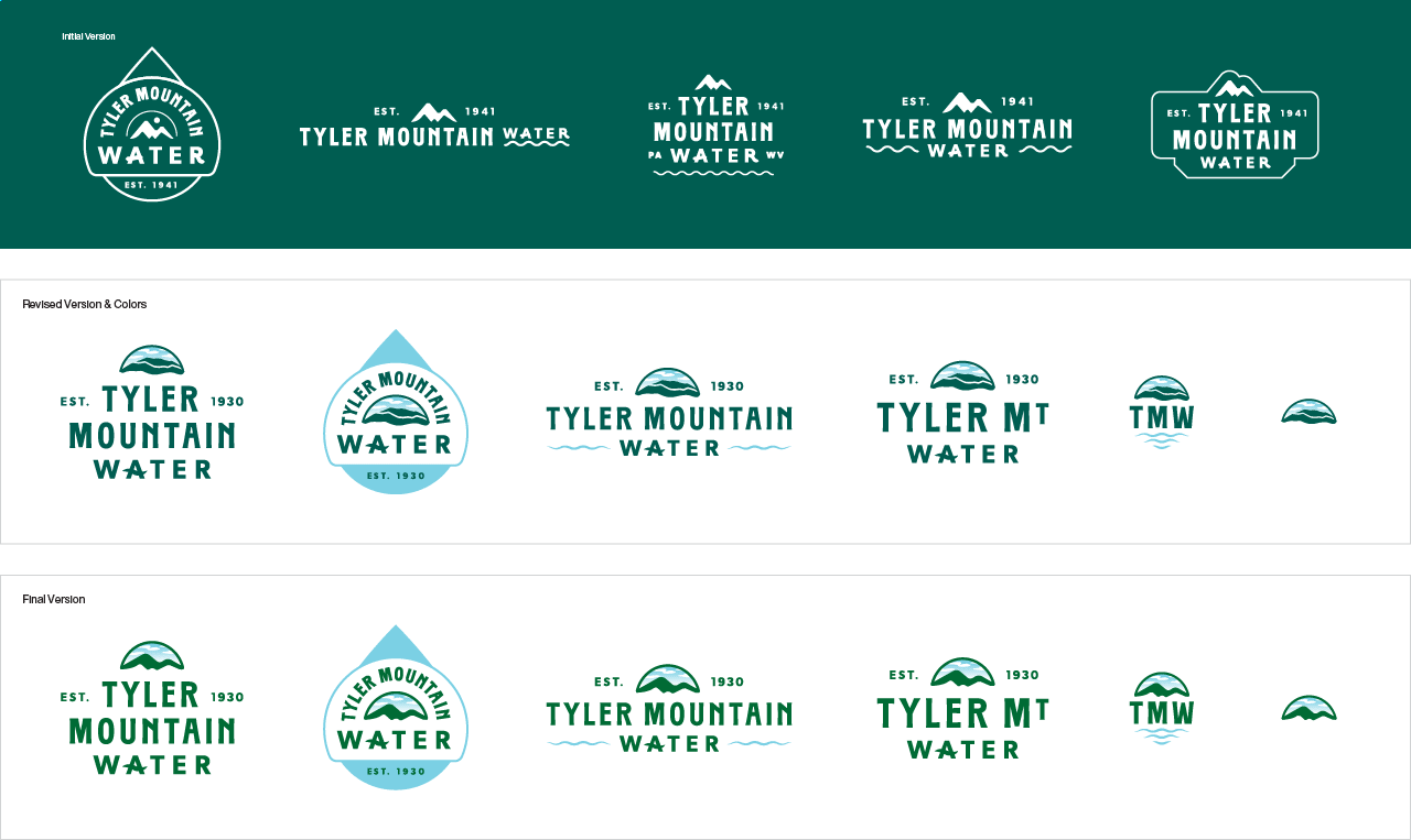
After internal client discussions took place, the options were narrowed down, and more comments on colors, fonts, and visuals were provided to make edits for the semifinal selections. In this phase, we expanded to show the brand in use. This is an important part of any corporate identity project because brands exist in a wide array of formats such as digital, print, or even texture, and physical spaces.
New Logo Selection
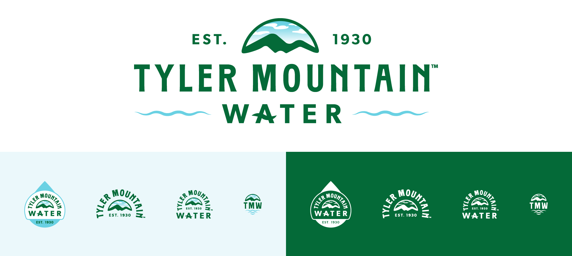
The final selection was chosen with one last adjustment request to show the mountain graphic differently. Color was also explored to further zero in on the right color combination of green and light blue, replacing the prior unnatural greens and blues. Once those changes were made and presented, the approval was given. 4CDesignWorks immediately developed labeling options for various water bottles in production and much-needed truck graphic designs.
Bottled Water Jug Logo Application
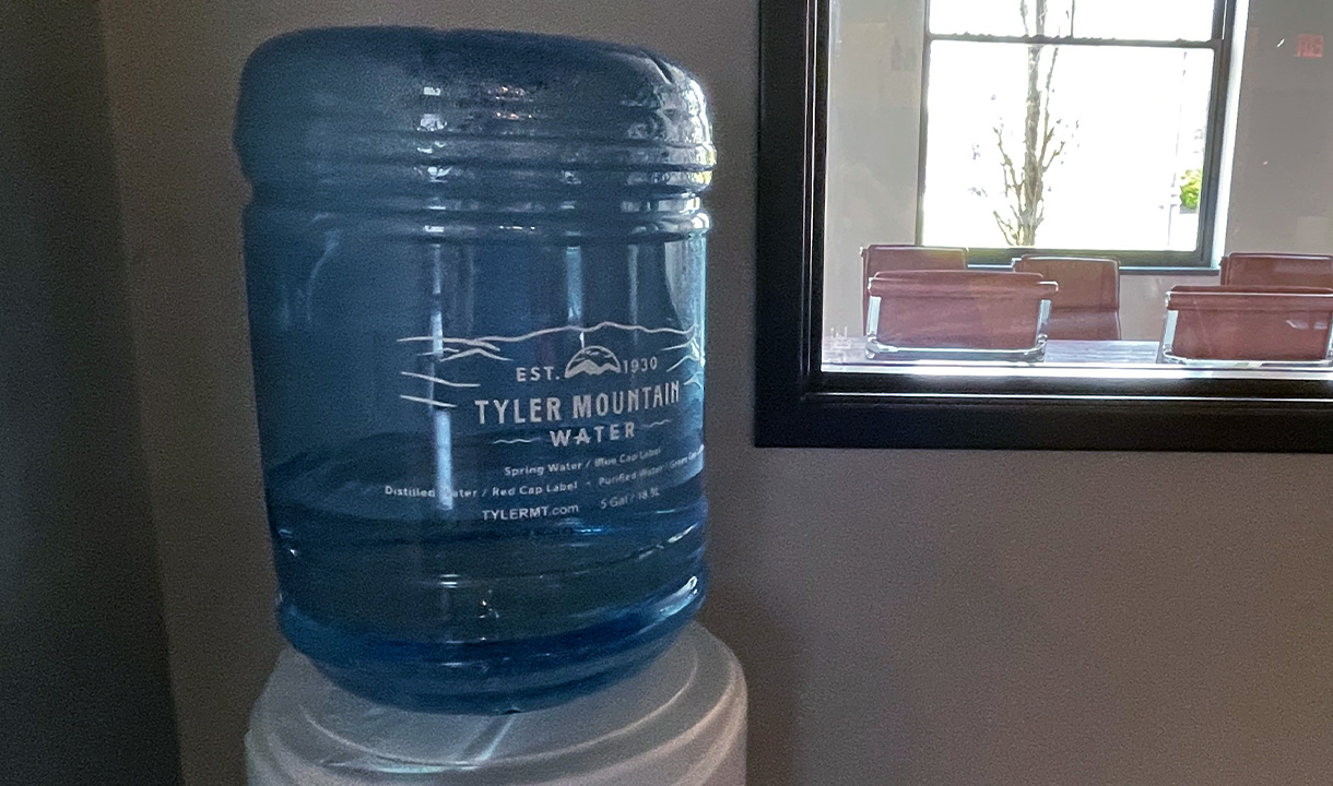
The first label task was for the bottled water jugs. The production process was a big consideration when it came to adding the new brand. The production process and the size of the label were assessed for each water bottle needed as the new brand was applied. For instance, screen printing was selected for the water jugs for longevity, and it also proved to be a cost savings in the long run. This was a good test for the new brand, due to the successful use of limited color and clear legibility.
Single Bottled Waters Logo Application
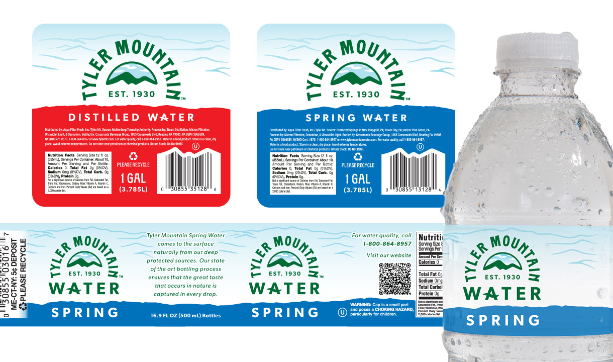
The suite of labels for single-bottle water, gallon jugs, and recyclable jugs was created next, putting the various logo lockups to use to showcase the pre-established set of colors for water types (spring, distilled, and purified), and putting the mountain and scene motif to work within each of the labels.
Bottled Water Vehicle Application
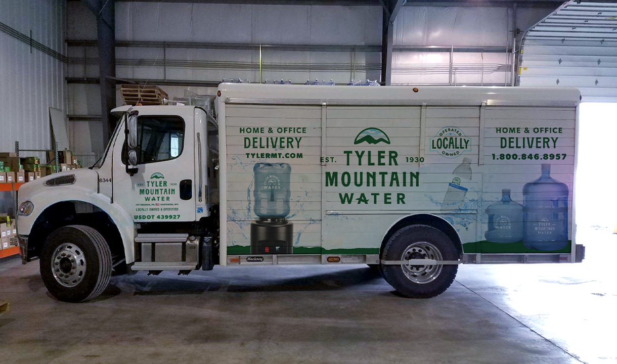
The trucks were also refined from the semifinal exploration and edited to fit the different spaces of the small sprinter van and the semi trucks. As part of this task, a badge graphic was created to highlight the ‘locally owned and operated’ aspect of the business along the standard contact options of the phone number and abridged website URL.