
This post is to act as a reference for competitive/comparative analysis. In this “report” we will take a look at some Western Pennsylvania regional construction companies and comment on the following items:
- Home page similarities
- How they present navigation
- and how they handle driving a user action.
This is not intended as an “end-all, be-all” assessment as there are many companies that operate in this space that vary from sizes big and small – to all types of specialties.
The home page is often times the initial point of entry for clients if they happen to connect to your company online. As such it is one of the more important aspects of your digital presence! With that, let’s dive in.
Home Page Similarities
Huge Intro Image
A great deal of the more recent construction company websites features some kind of very large introduction image right on the homepage. Commonly referred to as a ‘hero’ or ‘feature’ area of the site, the concept is for this area to be captivating and motivational. Often driving the viewer to take an action by clicking a title or button link.
This area has usually been populated with sliders – to condense multiple topics into one area as recently as 2-3 years ago. More recently, there is a school of thought that has moved away from that due to the widespread use of mobile browsing. Auto scrolling sliders can be annoying and hard to control on smaller screens, such as an iPhone (pre XS Max… or “almost-tablet” sizes).
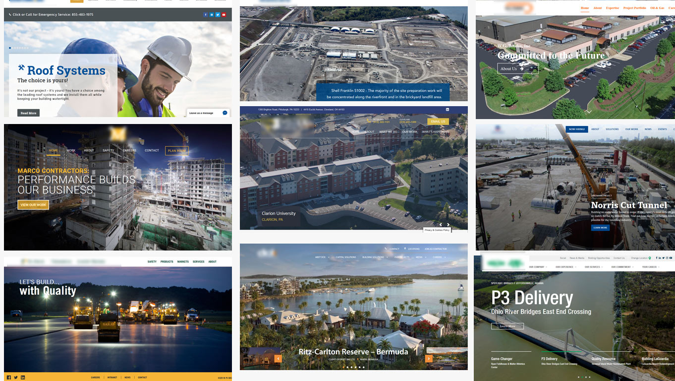
Intro – Linkage
Typically, within the massive image (or slider) there is an action button for the user to click. This could send the user to an About page, or photo gallery, a specific project, or a portfolio area. In the case, there isn’t, the image itself can act like a link.
Basic Introduction
This area can be incorporated into the large intro image or a brief summation of the company. Mission statements, outlook on safety, explanatory videos, and taglines are frequently shown in this section.
Highlighted Topics
A popular presentation is to have a highlighted area with 4 key topics. This can be specific services, locations, markets, divisions, projects, or even news. This is usually after an introduction message, or directly below the gigantic image.
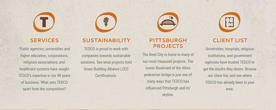
For services, this approach is great if there is the depth within the website. Being able to link to various services (even if there are sub-pages within said service), drives the user through the site and can take them directly to the type of project they are interested in.
Projects Displayed
The incorporation of projects can be seen in various areas. Sometimes this is called out in a specific area which can display an image carousel with 3 – 5 images that link to the specific project.
Condensed… or Tall
Some construction companies prefer to only show a bit of information. Maybe 2 sections (large intro image and services, for example), followed by the footer. While there are others that will include testimonials, projects, location information, client logos, projects, services, and more. The “Tall” option can act as a bit of a catch-all for new visitors.

The standard for most of these recent sites incorporates a more robust footer. These tend to have some form of exploded navigation – or navigation that is listed out and includes sub-pages, rather than just top-level links. This area can also contain links to social networks via icons, recent news, and even office location text.
Navigation Appearance
It isn’t uncommon to see a limit on navigation links. Six (6) to seven (7) appears to be what most sites are comfortable with. To consolidate the main navigation into those 6 or 7 groups, the terminology used trends toward one-word items. About, Company, Capabilities, Services, Solutions, Portfolio, Projects, Expertise, Safety, Careers, Employment, News, and Contact are frequently used.
When that direction isn’t used, it is common to see the navigation phrased with ownership to it; such as “Our Company,” “Our Services,” “Your Career” and the like.
Seven companies have navigation within a stark white background. This has the logo in its full color similar to how it would be seen on a piece of paper.

Other options provide a more ‘floating’ appearance where the navigation overlaps a brightly colored image.
Contact information and portal links are also popular in this navigation area. They provide quick access to phone numbers, locations, and options for sub-contractors.

Call to attention / Call to action
These areas are typically displayed in a way that they prompt the user to take an action. This could be to call a direct line, fill out a form, or simply click a button for more information.
The button action is popular and usually will lead a user to visit a specific page or form. Having the form route any communications directly to the contractor is preferred, as is the feature action of filling out an initial quote request. Either option can be used to capture data for a follow-up to an interested party, maybe even the next big client!
We at 4C pay close attention to how these trends evolve over time and how they can impact the perception of your contracting business. Are any of these trends of interest to you? Considering a bit of a renovation of your construction company website? Contact 4CDesignWorks to learn more!