
Feeling hungry? Recently, there have been food-related companies that have made a change to their brand. This change extends from everything to signs, television spots, logos, to packaging and beyond. In this post, we will take a look at three of them in Domino’s, Wendy’s, and Arby’s (no shortage of multiples in this one)!
Domino’s Rolls the dice!
Domino’s is a prime example of how branding can help change a company message and change perception.
This titan of cheesy goodness has been around for 52 years and had a product that they were selling as a cheap and fast item. The problem became people got what they paid for… or they didn’t. The motto of getting a pizza “in 30 minutes or less” became a business issue on multiple fronts.
They were losing customers and as a result losing money. In the span of a few years Domino’s changed everything from the ingredients of the product to the packaging it arrives in to their very logo. In the process, they’ve added new products that rival or support the sale of their main product: pizza!
As part of the company change online ordering and additional menu items were added to enhance the experience. Not only that, but apologetic television commercials were aired comparing the old with the new pizza. Evolving further, the word “pizza” was dropped so the additional products get equal spotlight.
Domino’s Before & After
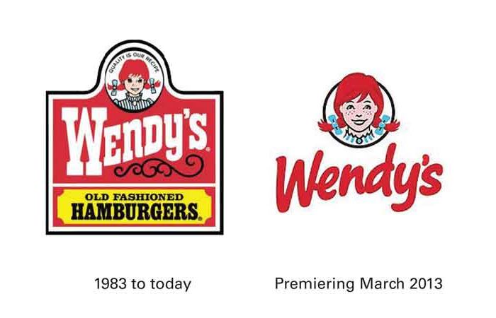
Wendy’s makes shakes to be more modern.
Competing with the giant that is McDonalds, good ole Wendy needed to break outside of her box! The established look had been around for over 30 years and apparently the rebrand took two years to come to the new look!
Much like Domino’s, a number of new products such as salads, ice-cream, wraps and even stuff like the Baconator or Pretzel Burger! In a similar move the “Old Fashioned Hamburgers” line has been dropped to streamline the look.
This look extends to the interiors of the restaurants and the packaging itself was simplified to emphasize the red color. With zing-worthy tag lines like “gingers welcome” and the smart roll-out plan already at work this brand is trending more upward than the typography in the name!
Arby’s… c’mon
Before I get into this one or show visuals, personally this is one of the worst “updates” I’ve seen. I’ll get into some potential good, but for now… It actually makes me long for the days when Rax were plentiful in the Pittsburgh area!

Arby’s… more like ugh-by’s!
Taking a different angle, Arby’s now is putting emphasis on the “fresh” approach to their menu. With recent ads taking a run at Subway for freshness “fraud” the logo adds new elements and retains one. By doing this, the logo itself is the visual version of the infamous “one of these things is not like the other” song!
The hat has dimension to it while the lowercase type and the emphasized (slicer blade visual) apostrophe both are flat as can be. I am not the only one that is a bit confused by this, but I believe I can see where they are going.
The hat is what makes Arby’s visually different from all the other fast-food joints. Not only that, but it’s also a part of the history of the company. It was custom created sign that eventually became visually attached to the name. There is a definite charm to it… buuuutttt my guess is the company will eventually drop this iconic hat and push the “fresh sliced” angle in doing so.
I can only imagine the nightmare of updating all that signage. Arby’s has been trying to move forward using similar hat-like shapes trying to move away from the hat (I recall the company attempted using a talking oven mitt and that guy isn’t around anymore). Unfortunately, that visual cue has many connotations that Arby’s is trying to move away from. They are now all about freshly sliced meats with a fast-food deli twist. Arby’s message is different now and I’m fairly certain there are many that fought to keep the hat as part of the logo because it’s associated with the company in every way! This brand could start to trend toward what Wendy’s is doing. Direct messaging, simple color palette, and emphasis on multiple products beyond the initial roast beef sandwich.
Arby’s… waitaminute?! Yeah, that’s better!
Newer commercials are displaying a completely different logo than the one shown above. All the materials within the store are the same, however, the logo now being shown on TV is a slight departure from the original logo. In my opinion, it’s waaaaaaaay better and closer to the original brand equity. The downside: this franchise just spent a ton of money making an update and then almost a year later correcting it.

I’ll take the number 3, please!
The damage is done and the materials that were produced with the tweener logo are stuck – in the same kind of limbo that the 2-but-it’s-kinda-3-D logo is. However, this back and forth change could confuse a lot of individuals. Just ask JCPenny’s how well that goes over with people!
That’s it for now on branding and fast food. Hopefully, this left you hungry for more on the topic of branding, rather than for a pizza, wings, or a burger!