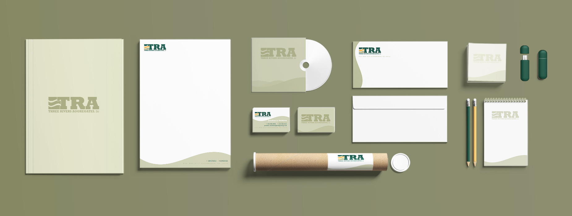
Three Rivers Aggregates (TRA) approached 4CDesignWorks with the request to rebrand their existing corporate identity and stationary package. TRA supplies various construction sites with multiple forms of aggregate, the highest being sand.


The inspiration for the logo came from Pittsburgh’s Three Rivers, celebrating the company’s name and location. Due to sand being the most in-demand aggregate for the company, the logo also looks like a sand dune. The colors were selected from TRA’s parent company, P.J. Dick, Trumbull & Lindy.
- Corporate Logo & Identity
- Stationary Package
