In the digital age, a strong online presence is essential for non-profit organizations to tell impactful stories and connect with their audiences. Crafting compelling non-profit website designs becomes vital. By harnessing the power of visual storytelling, these websites have the potential to inspire action, raise awareness, and foster positive change.
In this article, we will explore the strategies and techniques employed by successful non-profit websites to captivate their visitors and effectively convey their mission. Through engaging visuals, intuitive navigation, and persuasive content, these websites create immersive experiences that leave a lasting impression on their audience.
We will discuss the importance of aligning design elements with the organization’s brand voice and values, as well as the role of user experience in creating a seamless and enjoyable journey for visitors.
Join us as we delve into the art of crafting compelling non-profit website designs and discover how to effectively communicate your organization’s story to inspire action and make a difference.
Visual storytelling in non-profit website design
Effective non-profit website design is not just about creating an aesthetically pleasing interface; it’s about harnessing the power of visual storytelling to captivate and inspire your audience. Visual storytelling is a powerful tool that can evoke emotions, convey your organization’s mission, prompt visitors to donate, and drive meaningful action from your visitors.
At the heart of successful non-profit website design is the ability to weave a compelling narrative through visuals. By carefully curating photography, supportive graphics, and multimedia elements, you can paint a vivid picture of the impact your organization is making and the change you strive to create. This approach engages your audience and helps them connect with your cause on a deeper level.
Incorporating visuals that resonate with your target audience is crucial. Whether it’s showcasing the faces of the individuals you serve, highlighting the tangible results of your programs, or depicting the transformation your organization facilitates. Captivate visitors by striking the right emotional chords and you can inspire them to become active supporters, donors, or volunteers, ultimately amplifying your reach and impact.
Successful non-profit website design that use visual storytelling
Non-profit organizations that have mastered the art of crafting compelling website designs often share a common set of characteristics. These designs captivate their audience and effectively communicate their mission, values, and impact.
Charity: Water
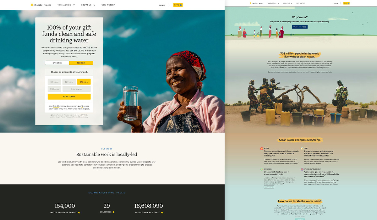
Charity: Water is a non-profit organization dedicated to providing clean and safe drinking water to communities in need. The Charity: Water website is a masterclass in user experience, branding, and visual storytelling.
Why it’s successful:
- The website’s intuitive navigation links start with “Take Action”. It doesn’t get more direct than that!
- Photos, which importantly include people, are used to show the positive impact the organization makes.
- Donation forms are available right away on key pages (in the “above the fold” location on most browsers), making it easy to take that action as users learn about the organization.
- Strategic placement of multimedia elements (interactive maps and data visualizations) effectively conveys the organization’s mission and the tangible results of their work.
- The “Why Water” page features a captivating video that allows visitors to witness the transformative impact of clean water firsthand.
Off-yet-on-topic note: our resident design guru, Josh once raised money for this cause by shaving his head (and he HATES haircuts)!
World Wildlife Fund (WWF)
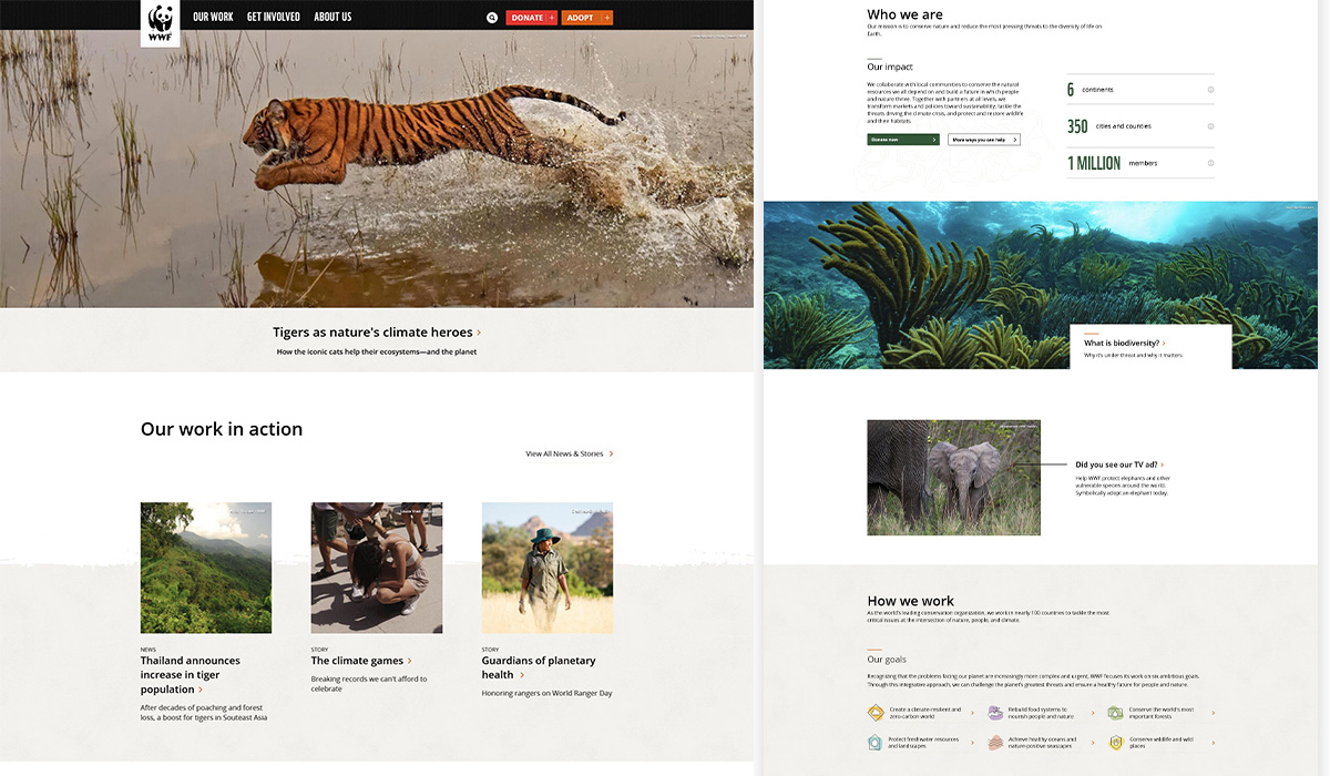
Not to be confused with professional wrestling. The WWF’s website is a stunning showcase of visual storytelling, featuring breathtaking imagery of the natural world and the endangered species they aim to protect.
Why it’s successful:
- The navigation groups a lot of sub-pages into 3 key areas with 2 ‘action buttons’ for donation and adoption.
- The homepage immediately immerses visitors in the organization’s cause, with a large, striking hero image that sets the tone for the entire experience.
- Statistics are intertwined with “who we are” messaging which shows their impact.
- As the user scrolls through the website, they are presented with a seamless blend of visuals and informative content, highlighting the WWF’s conservation efforts and the urgent need for action.
- Their goals are segmented into 6 key areas that are easy to understand and not “alphabet soup” or overcommunicated.
Habitat for Humanity
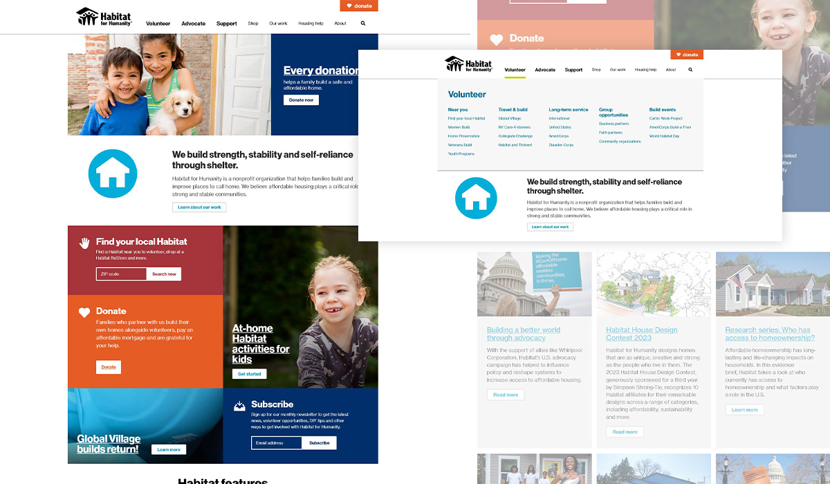
The logo immediately communicates what this organization does, and the Habitat for Humanity website expands on that through photography, bright colors, and simplified icons.
Why it’s successful:
- The navigation groups a lot of sub-pages into 3 key links (larger bolder text), 4 other links, and a highlighted donate button.
- Large areas of solid colors that identify you are looking at a different subject (i.e. Donation is often associated with orange).
- The organization’s mission statement is directly under the initial donation CTA (Call To Action), with an uplifting image with people that shows what their goal is.
- News is featured in key sections above the footer, these stories are often related to the web page you are on.
The Little Fox – Toby’s Foundation
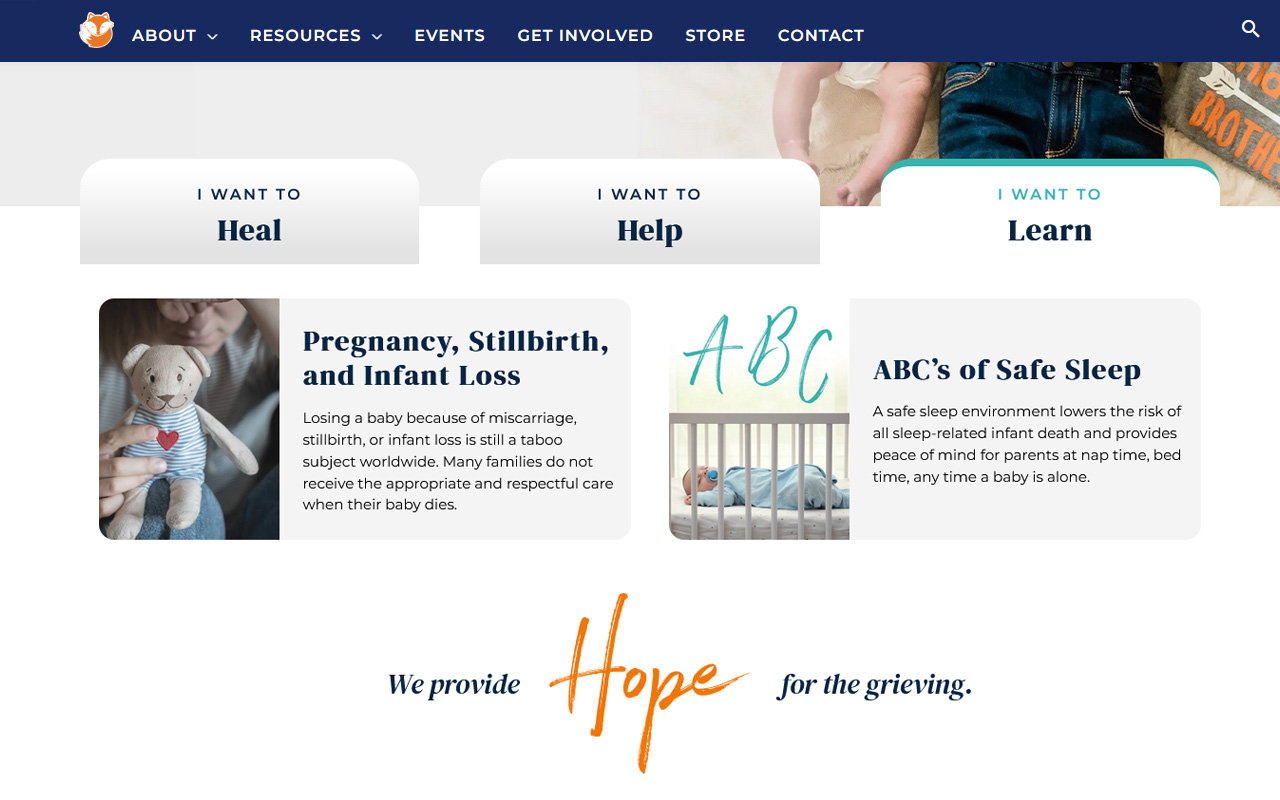
Established in 2018, this is a newer non-profit organization. The current version of the Little Fox website is it’s second version as it continues to grow year-after-year. With roots in Pittsburgh, 4C had the pleasure of working on this website redesign (and winning some awards for it). Visitors are not disappointed when greeted with a fox logo and a fresh color combination of mint, navy, and orange. Diving deeper the organization highlights key actions that a user can browse through while being educated on what the foundation is all about.
Why it’s successful:
- While the navigation has 7 links, key ones organize their sub-pages into visually digestible mega menus without overwhelming the user.
- The homepage boasts a tabbed presentation of “heal”, “help”, and “learn” immediately tell the user what they may find in those subjects.
- A floating donation button ribbon follows the user on any page they are on, giving them a quick action.
- Hub pages – such as “Get Involved” and “Resources” – help direct the user to other sections of the website. These sub-pages are reflected in the navigation.
- Events are a big part of what this organization holds to raise funds and awareness, with their annual gala being the biggest one that requires its own web page.
Make A Wish
Even though this is a well-known organization is a household name, their website hits the right storytelling beats. Soft colors, photography focusing on children, and live notifications make this a success.
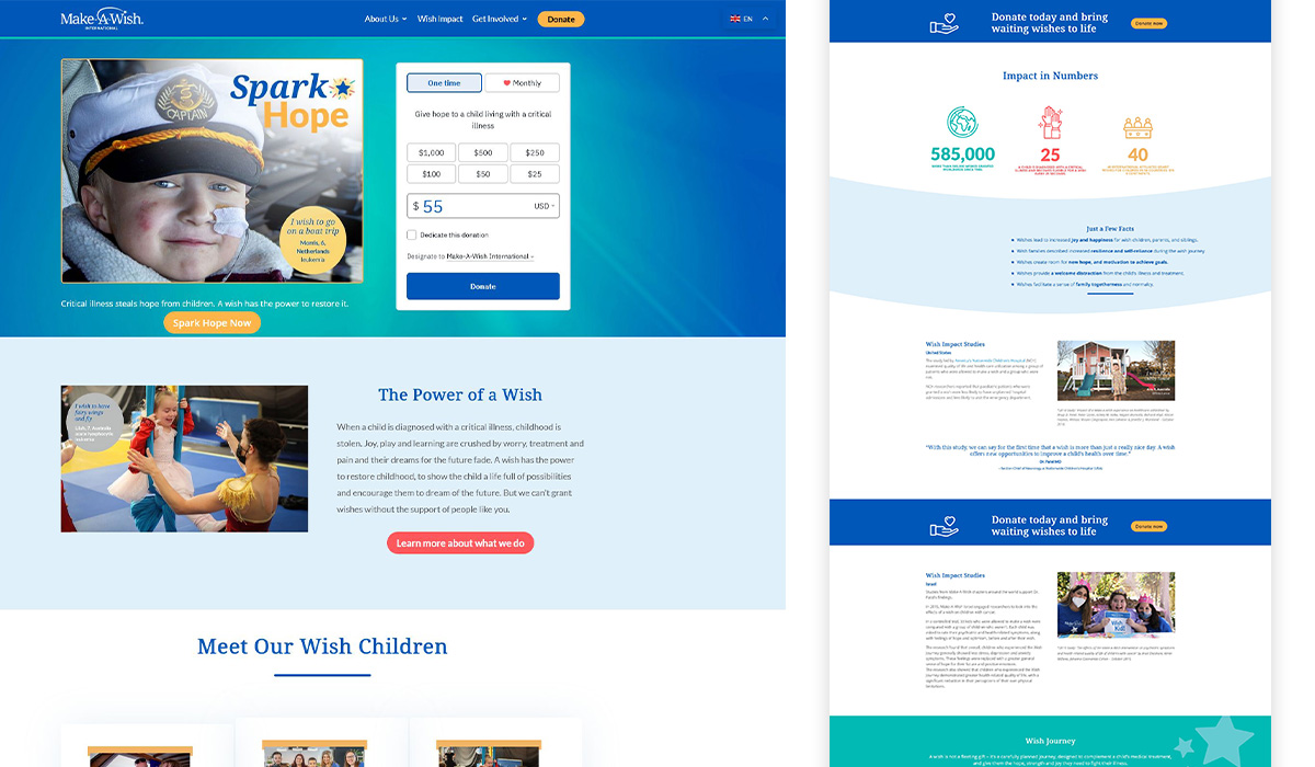
Why it’s successful:
- Despite being an international organization, they consolidate the navigation to 4 items to not overwhelm the viewer.
- Here is another instance of a donation form paired with a hopeful photo that hints at what the organization does.
- The “Meet Our Wish Children” is an excellent way to create depth for the website and tell stories in a news-like fashion.
- Blue hues are shown throughout the website to show a strong sense of branding. The curve artwork used hints at the branding.
- The donation notification that pops up while the user is browsing is a great way to nudge the user to donate and join others supporting the cause.
- Large and surprising statistics are displayed along with help prompts to turn negatives into positives.
What do these websites have in common?
These successful non-profit website designs share a common thread: they prioritize storytelling in concert with visuals (graphics and UI/UX) to create emotional connections with their audience. This inspires donors to give, take action to support, and helps them make a lasting impact on the world.
Are you looking for a non-profit website with a focus on visual storytelling?
We can help! Work with us and we can collaborate on the best way to tell your story. We tailor every project to each client and can use the successes highlighted in the website examples above to your advantage. If you aren’t sure, try using us to do a complimentary Health Check as a starting point.