
As we approach the publicized move of The Art Institute of Pittsburgh (or “AIP” as many have called it) from the location I grew familiar with, as I attended (good ole’ 420 Blvd. of the Allies), some reflection is bound to happen. It’s crazy to think that my association of AIP is so strongly tied to that building. I can remember having some amount of ease that at least my dad knew where to direct me for the small details like parking and maybe where to grab a bite to eat that was close enough for me not to miss class. He was familiar with the location as his company was in the building before AIP moved in. Since then one of my favorite lunch destinations (a solid pizza shop with a great deal for many ‘starving’ artists) has changed ownership and names, and the Pittsburgh Penguins only had two cups!
While a senior going through the rigors of working full time, going to school full time, stressing over my portfolio, factoring some time with friends and family, as well as the trappings of being a 22 year old trying to sort out the whole ‘adult thing’ – I often wished I had the opportunity to have my work reviewed by professionals that weren’t my teachers.
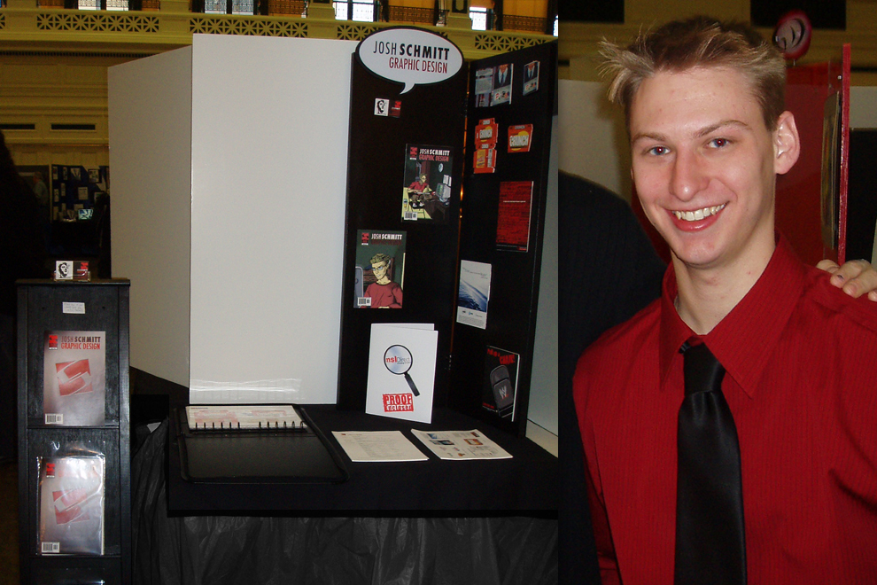
The bright-eyed 22-year-old Josh at graduation.
For a while now, I’ve been given the very excellent opportunity to give back to my alma mater, by participating in mock interview sessions. These mock interviews are pretty rapid in succession and they are intended to be fairly quick (20 minutes max). In my experience, if an in-person interview is less than a half-hour… then something has gone wrong!
The industry has changed fairly rapidly since my foray into it in the early aughts. Access to online portfolios, the ability to submit resumes, along with sample sheets, links, and an always recommended cover letter, has become more commonplace. There are even online websites to gain freelance experience though that become a great gateway to getting hired.
Let’s get real here, interviewing is weird! From an employer standpoint: there is likely a need that they are looking to fill. From a prospective employee standpoint, it’s the desire to be good enough to not be ignored… and then hired.
Today, if you are asked in to interview for a possible opening, or contracting position, the actual work in your portfolio piqued interest enough to pass step one. Someone liked your art, and that’s good! After that, it’s about the fit with the organization, personality, and of course the financial end of things.
If you are asked in to interview for a possible opening, […] your portfolio piqued interest enough to pass step one. Someone liked your art, and that’s good!
Here are some tips that I’ve often told applicants the potentially help them through this process:
Say something that will make you stand out/memorable.
One applicant had “Crane Operator” as a skill within their resume, that showed some personality, humor, and even a touch of creativity).
Avoid listing something you are not an expert on as a skill or be specific as to competency.
This has been a Pet peeve of mine on resumes. If a “skill” is on a resume, the expectation would be for the employee to be able to complete the associated tasks. In recent years, there has been a trend of seeing ‘proficiency statistics’ in the form of infographics on resumes. Depending on the intended audience something like this can be helpful!
Learn to work with a budget.
Money affects business decisions. A great piece can be limited color and save costs to a client. If you are effective within a budget you will gain trust from a client.
Learn time management.
Working under pressure via time restraints is often part of the job. I encourage young creatives to keep a record of the time they spend on work.
Get comfortable with estimating.
How long do you think it takes you to do a task? Time yourself to see if you are correct.
Try to remember any additional costs that may factor in (a subscription service for a tool, for example).
Speak “business” and/or “reason” to clients.
Most clients don’t get aesthetic and have to have a reason to not be attached to personal preference. For example, using black on dark green is going to be really hard to read – if someone can’t read they can’t click to buy the product!
This goes back to the old “Know your audience” point. The client is a factor in that. They need to be pitched and accept where you are trending.
Thanks for taking the trip down memory lane with me, and I hope some of these pointers make a difference to those looking to break into this very strange, but very awesome field of work!