You may be reading this because your company needs a facelift. Many do some due-diligence and do some online searching for various branding agencies that can help. Often, this is because there are several challenges with the brand as currently constructed.
Some of these issues can be that your logo looks dated, no one can find a high-quality version anywhere (even on floppy disc), it has reproduction issues, there isn’t a guide to explain which approved versions should be used, it doesn’t translate well in one color, the one logo file you are certain you have is an image pasted within a Word document, and overall doesn’t inspire confidence (roughly translated: “is old, and fugly”). Trust me on this… you aren’t alone!

Before breaking into song and tap-dancing (because I very much enjoy logos… and who doesn’t like when people spontaneously burst into song and dance?!) there are some things you should know:
A Logo is part of your overall brand identity.
It is the entry point to your brand. Typically one of the first things people will see in association to your company and what its message is about.
One of my all-time favorite graphic designers, Paula Scher, spoke at a branding conference about identity and why it is so very important. You can see a portion of this great speech here. Why do I consider her an authority on this topic… oh, you might have seen some of her work (The logos for CNN, Citibank, Windows 8, and recently WeightWatchers… along with revolutionary work for The Public Theater). She speaks of the topic of branding in an enlightened way:
Brand Identity is: (Form + Application) X (Audience + Time).
“If you make the form and apply it consistently, but also surprisingly, theoretically with the right audience […] and enough time – it resonates… and that’s [when] you can make a judgement about it.”
Paula Scher (an all-time renowned Graphic Designer)
In this explanation, the form is the logo and the applications are a key component. So, the logo (or form) is an entry point and at the core, should communicate some kind of message about your business. Even if it’s something as simple as the company name (a wordmark). If it’s some fancy text stating the company name accompanied by some kind of unique icon/image, that’s great too! Storybooks come with all kinds of different covers, and a logo is no different.
This brings us to the next part of the equation: Applications.
Name the last time you saw a logo on white and always on white, without fail. I’ll play spoiler here… it doesn’t happen often at all.
When it comes to branding exercises we stress the importance of seeing a logo exist beyond being lost in the white abyss of a piece of paper, because 98.675% of the time an audience won’t see it that way!

Logos are forms that are meant to be applied and experienced.
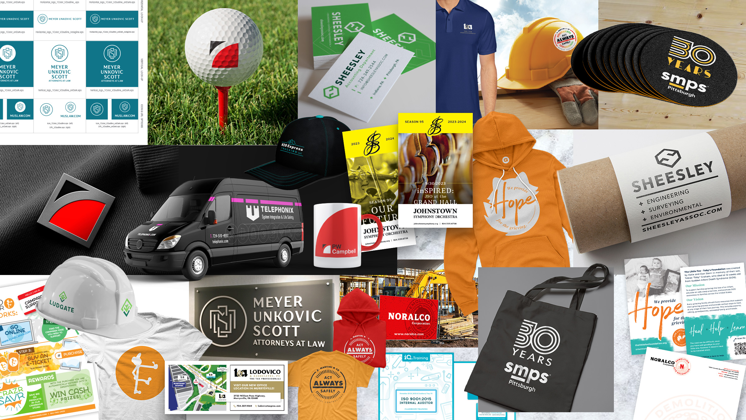
People interact with the logo and your brand on multiple levels, and sometimes, multiple times a day. Some items are printed, others are electronic. Some are tactile, others will always reside in the interwebs. Sometimes you’ll see a small logo and other times it will be ginormous! Maybe it will be on a billboard in a high traffic area or as small as on a drink coaster, pin, or sticker.

Logo applications are important because they are the first glimpse of how your brand is experienced.
The results of seeing a logo applied can drastically change opinions on a particular brand identity/direction. There are some extremely smart logos that are very simple in nature and when applied they come to life. At a minimum, when considering a new logo, one of the steps should be seeing applications. The possibilities fluctuate given the company’s needs. Sometimes apparel is big, other times it’s a stationery set, a proposed mast-head (“above the fold”) section of a website, and a portion of a social network that is frequently promoted and used.

Logo applications are important because they can show how flexible your brand is (or could be).
If your logo isn’t flexible then it’s limiting potential growth, at least in the public eye. There are times when an audience will look at a company’s brand identity and say all of the things first mentioned in this article. If the logo and complimentary branding LOOKS old that is the audience’s perception. In the mind’s eye perception is reality. Your brand should inspire confidence not have a reverse effect!
Often, a company may select a logo without going through this important part of the branding process. This is where many brands fall apart. The logo may look OK enough on its own… but what about it might look like as a magazine advertisement that promotes your organization? What about it being shoved into a corner of a social profile? How about it being handed out as a business card? Or digitally as part of an electronic signature within email?
These things can be “tested” by putting the logo into an application wringer. Many of the large branding companies out there do this exercise to mitigate risk for Fortune 500 companies. We believe every serious organization should have the same attention that those conglomerations get!
Transform your business with improved branding by 4CDesignWorks
So before taking that leap to update or refresh your company brand, take a look at all the items in the equation (form, application, audience, and time) and reflect on each one of them as it relates to the big picture. Explore our branding process, then shoot us a call or fill out a form to contact us and we can get started!
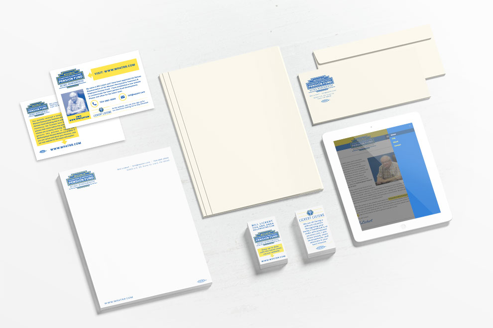
Pictured: Western PA Teamsters & Employers Pension Fund Retiree Representative applied logo – stationery set & tablet view
Note: this post was originally created based on “year-end” opinions on the best and worst of logos. Specifically, the Merck logo is seen as a before and after image below (sourced from this article). While this was years ago – the topic will always be relevant.